

Outsystems provides multiple ways to style UI elements, but you shouldn't use all of them. Luckily, Outsystems can help you create reusable UI widgets. All it requires is some discipline and a little CSS knowledge.
Style tab
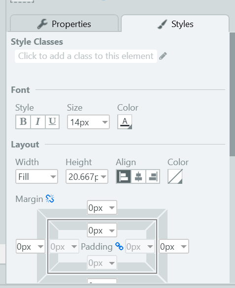
One of the ways you can style an interface element is the style tab in Service Studio. It contains the basics of styles you can apply, like making font bold, align centre and changing colours. This translates to CSS that is applied to the selected element. Besides that, you can enter CSS directly in the input below it. This is a quick and dirty way in changing the appearance of your application. But, there's a downside to it. Actually there are more, but the major one is this: re-usability. Styles are often repeated, so you should structure your styling in such a way it leverages the reusability of CSS.
CSS classes
Styling added in the Styles tab are injected in the style property of an HTML element. Each CSS property needs to be declared separately. If you're using a red colour, each element will need to have style="color: red" set. And since you're sending each character of an HTML file over the line, this will hinder performance. So, using CSS classes is the way to go when styling elements. You can include your CSS rules on a theme, screen or block level. To improve re-usability it's best to include common rules in a theme, and leave as few as possible in screens. Theme CSS files are cached, so will be quicker to load.
Web blocks
You're probably familiar with the concept of web blocks, which allow you to create reusable block interface elements and logic. They can contain both Outsystems widgets and custom build elements. Web blocks can be shared across modules and applications. This way you can reuse a block in different applications. For example, you may create a library of custom widgets handling forms. Often you will have to find a balance between customization and standardization. Everything on a block level will not be accessible from a parent (screen). This can be annoying, if you're using the web block purely for styling. But here's the trick: introducing placeholders!
Placeholders
Placeholders allow you to inject elements from parent in a block. In general terms, it leaves an empty area to be filled with an expression, button or other widgets. This element lives in the web block but can be manipulated or refreshed by the parent. If you're not getting the concept, don't worry, I'll show you an example.
Demo
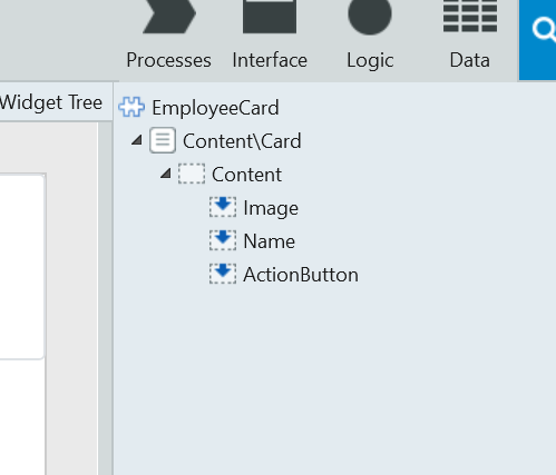
Here I've created a web block contain a number of placeholders, like Image, Name and ActionButton. We'll use this web block solely for styling, so we won't mind the fact that we'll not be able to handle events from the block itself. If you want to learn more about web blocks that implement their own logic, check the Outsystems documentation. With the web block created, we can open the CSS screen, and start adding custom CSS rules. As mention before, I encourage using classes from the theme. So to the Name placeholder, I'll add the margin-top-m class to Style Classes.

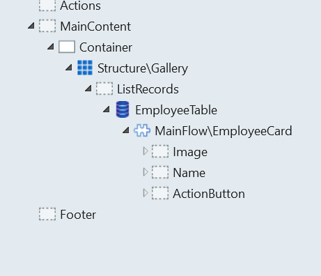
We'll do the same to the ActionButton placeholder. Now we'll add the web block to a screen. I added mine to a ListRecord with data from the Sample_Employee entity from the OutSystemsSampleDataDB module. It'll look something like this.
For the purpose of this demo I'll add the rest of the CSS to the block CSS screen. Go ahead and add these CSS rules.
.card img {
    border-radius:  50%;
}

.card .Button {
    background: var(--color-cyan-darker);
}
Now I'm dropping an Image widget in the Image placeholder. Since the Sample_Employee entity has an image attribute available, we can set the Type property to Database and the Attribute to Sample_Employee.Picture. Set the other ones as listed below.

Drag in an Expression and set the value to EmployeeTable.List.Current.Sample_Employee.FirstName + " " + EmployeeTable.List.Current.Sample_Employee.LastName.

Add a button to the ActionButton placeholder. Under Destination choose New screen action. This can be filled with whatever logic you want, I'm going for a feedback message allerting the user email address. Hit F5 or the Publish button and your module will be uploaded to the server. After uploading, click Open in browser. You'll see a screen with beautifully styled web blocks!